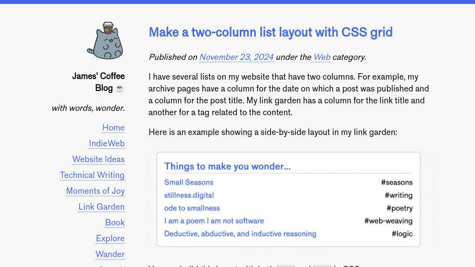
I have several lists on my website that have two columns. For example, my archive pages have a column for the date on which a post was published and a column for the post title. My link garden has a column for the link title and another for a tag related to the content.
Here is an example showing a side-by-side layout in my link garden:

You can build this layout with both flex and grid in CSS.
I was playing around with how make a side-by-side list layout with CSS grid, and wanted to write a post to explain how you can build such a layout. By the end of this guide, we will make a side-by-side list that looks like this:

You can then style the list with the colours, borders, spacing, and other designs you want.
Let’s begin!
Step #1: Make a list to style
To start, we need some HTML to style. Let’s start with a layout that contains the boilerplate that we need for a HTML document: a head and a body tag. Then, let’s add a list where each item contains two tags: a link to a bookmark, and a span with a tag for the bookmark:
<!DOCTYPE html>
<html lang="en">
<head>
	<style></style>
</head>
<body>
    <ul>
        <li><a href="https://www.hustwit.com/helvetica">Helvetica Documentary</a> <span>#typography</span></li>
        <li><a href="https://www.nytimes.com/2024/10/10/arts/design/impressionism-monet-degas-renoir.html">How the Impressionists Became the World’s Favorite Painters, and the Most Misunderstood</a> <span>#art</span></li>
    </ul>
</body>
</html>
Above, we have a list with two items. Each item has a link pointing to a web resource, and a span that contains a tag.
Here is what our list looks like:

With our HTML ready, we can start writing styles!
Step #2: Reset the list styles
By default, HTML lists have a few styles applied. We are going to remove the padding and list style for this guide. Then, we need to set a width for our list. This is because we are going to have two columns. By setting a maximum width, we can ensure our list doesn’t stretch too far on wide screens. Add the following styles to the style tag in the head of the document:
ul {
    max-width: 35em;
    width: 100%;
    list-style: none;
    padding: 0;
}
The rule max-width: 35rem defines a maximum width. I often use 35-45em for text to ensure that the text on the page does not extend too far. Text that extends across a whole page can be hard to read.
The width: 100% rule ensures our list extends to the maximum width.
Here is what our list looks like now:

The default list bullet point has been removed, and we have no padding. Our container also has a maximum width, which will become clear in the next step.
Step #3: Configure the grid
We are going to use CSS grid to create a two-column layout. We will have one column for a bookmark link and another column for the tag. Add the following styles to the document:
ul li {
    display: grid;
    grid-template-columns: 3fr 1fr;
    gap: 1rem;
    padding-bottom: 0.5rem;
}
This code sets all list items to display as a grid. Each list item will have two “grid columns.” The first column will measure 3 “fractions” of the width of the parent container. The second column will measure 1 fraction of the width of the parent container.
This means our bookmark link will have 75% of the 35rem width of the ul and the tag will have 25% of the room. The 1em gap creates a gap between our template columns. This ensures that our text doesn’t appear exactly next to each other.
Here is what our list looks like on desktop:

We now have a two column layout!
Step #4: Write mobile styles
Here is what the layout looks like at the resolution of an iPhone 11 Pro:

While the layout looks good on mobile, the long title of the second item wraps across three lines. We could give each title more room by moving the tag below the list item. Here is what that would look like:

In this version, the title has the full width of the list on mobile. Let’s write the styles for that.
Add the following styles to your stylesheet:
@media (max-width: 600px) {
    ul li {
        grid-template-columns: 1fr;
        gap: 0;
    }
}
Here, we set a breakpoint at 600px. When the device width is 600px or less, the styles in the media query above will be applied to our document.
In this style, we make two changes:
- We create a one-column layout.
- We remove the gap between the columns.
Removing the gap ensures that the tags and titles are grouped together. If we keep the gap, there will be spacing below the title.
Here is what our list looks like on the iPhone 11 Pro now:

The titles have more room and the tag and titles are still grouped together. Great!
Conclusion
There are many uses for two-column list layouts. You could use them for date archive pages, for bookmarks, for blogrolls, for creating instruction layouts (like the layout used for instructions on iFixIt), and more. I use two-column lists across my site, and I’m thinking about how to use them more!


