When I was re-designing my website, I put a lot of thought into the content section. I wanted to ensure my content was as readable as possible for as many people as possible.
This meant that I wanted to design a default experience that adheres to design best practices. The design also had to be accessible, which would ensure that those using assistive technologies could navigate and understand my site.
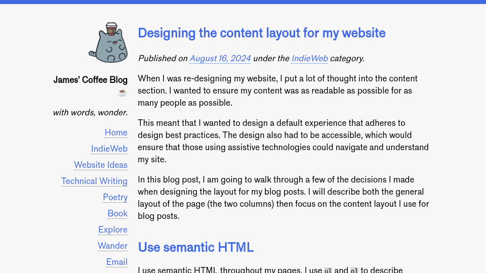
In this blog post, I am going to walk through a few of the decisions I made when designing the layout for my blog posts. I will describe both the general layout of the page (the two columns) then focus on the content layout I use for blog posts.
Use semantic HTML
I use semantic HTML throughout my pages. I use ul and ol to describe unordered and ordered lists, respectively. I use h1, h2, etc. for headings; one h1 is set for the page.
If there is a semantic HTML element to do something I want to do – from defining a navigation bar to describing a table – I will use it before creating a div.
Semantic elements offer significant accessibility affordances. Thus, semantic HTML elements are the foundation of my content design.
Container width
My website uses a two-column layout. The first column is for navigation, listing links that take you to various significant pages on my website. The second column is for content, which is either my home page, a blog post, a navigation page (i.e. an archive page), or one of various pages that has its own content structure.
The columns on my website – the navigation sidebar and the main content – are centered in the middle of the page. The maximum width of the main container is 50em. ems are relative to the size of the font on the page. I then use CSS Grid to split the container into two parts: the sidebar (20% of the 50em container), and the main content (80% of the 50em container).
To ensure the sidebar and the main content are visually distinct, a 1em grid gap is applied. This space helps the webpage “breathe” a bit more. With the visual distinction afforded by space, it is easier to focus on and skim through a container.
Limiting the width of the content container is essential because it is harder to read content over long widths. Imagine a newspaper where every story was the full width of the page. It would be hard to read. Similarly, web pages where sentences take up most of the width of the page are hard to follow. I find 35-40em a good range for content widths where the content is not so narrow or wide that readability is compromised. In the 35-40em range, reading feels natural.
I decided to center the content because I prefer to read content that is close to the center of the page. I was inspired by journalism websites such as the Guardian which follow this pattern (NB: the Guardian has visual assets that stick out to the side. I like this pattern and may one day use it. I have yet to explore multimedia blog posts to a great extent.)
Font choice
I love Helvetica. It is a readable font and extensible to a wide variety of design systems. With that said, for this website I wanted something a little bit different: a font close to Helvetica, but with a bit more personality.
Nick Simson, who has written an excellent blog series on typography, recommended Standard, a font inspired by Akzidenz Grotesk, the font that inspired Helvetica. When I tried Standard on the page, I noticed that my words had a similar ease of reading to Helvetica, but had a bit more identity given the extent to which Helvetica is used on the web. I was happy with my choice: readable, but a bit different.
I did try other fonts, such as Vivaldi, but none felt like Standard. I learned that fonts really do have vibes; it takes some exploration and experimentation to find the right font.
Before choosing a font, always check its license and evaluate whether the terms – and cost – are appropriate for your project. After some digging, I found that Standard is licensed under an SIL Open Font License. Under the license, the font can be used for personal use without payment.
Line height
Text that is close together is harder to read. Lines of text that are too far apart is also harder to read.
You can control how close lines of text are using the line-height CSS property. My blog posts use a line height of 1.5. This means the line height will be 150% of the font size. I have heard recommendations that say that 1.4-1.6 is a good range for experimentation: in this range, you can find spacing that lets the text breathe without the text becoming disjointed.
This is applied to all text elements in content: the paragraphs, text in list items, etc.
Spacing between headings and text
The closer elements on a web page are to each other, the more they feel connected. With that in mind, headings that are evenly spaced feel less connected to any particular part of a page. Whereas headings that have space on top create a clear visual distinction between the text above the heading and the heading that introduces a new section.
My headings in articles have two styles:
padding-top: 0.5em: This creates a space above a heading, and;margin-bottom: 0: This removes some of the spacing directly below a heading.
With this style, I can make a heading feel closer to the content that follows, and create a clearer distinction between the previous section that a heading follows.
Distinguishing multimedia, quotes, and code
I regularly use quotes and code in blog posts; I sometimes use images, too. It was essential for me to think about how these would fit in to my new blog post content design. Every element matters.
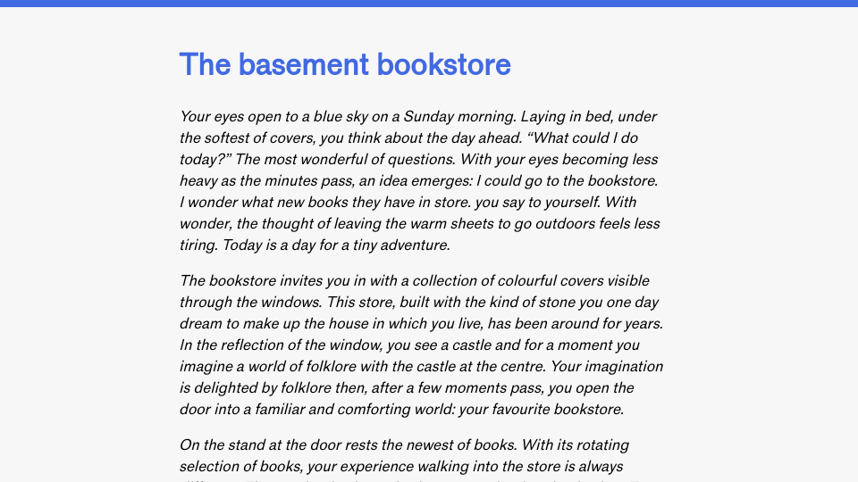
I decided that I want my code, quotes, and multimedia (images and video) to be visually distinct from the page. Images and video are distinct with spacing. I apply the 1.5 line height to all elements on the page using the * { line-height: 1.5 } rule, which ensures enough spacing between text and the multimedia. But code and quotes need more visual differentiation since they are also text.
To differentiate quotes from prose, I applied a coloured border, like so:
This is a quote.
The text is also italicised.
This clearly distinguishes text from a quote, using affordances already known for quotes across the web: visual distinction and italics. The coloured border was a touch of personal style. I use the same colour as my site theme: royal blue. This colour is used for my site banner at the top of the page, links, and more. Using the same colour helps make the quotations feel integrated with the rest of the page.
Inline code snippets are distinguished with a light grey background. This is because such snippets are typically short (i.e. a single word or two). I have opted not to use syntax highlighting since there is limited context within a given snippet. Applying syntax highlighting in contexts where a single word or two of code is referenced may be confusing and hard to follow.
Long-form code snippets that are not inline are distinguished in two ways:
- With a coloured background, and;
- With syntax highlighted text.
The coloured background is used exclusively for code, which helps me build an association in the reader’s mind of the background and the presence of a code element. The syntax highlighting, which is implemented using a Python package and rendered as HTML code when my site is generated, helps ensure the code is readable. I use the pygments Python package to generate the syntax code and the CSS required to render it.
With syntax highlighting, it is easier to skim and understand code. Without syntax highlighting, on the other hand, it takes more energy to build a mental understanding of the code and the syntactic significance of different words in the code.
Conclusion
Content design is a deliberate process. It took me days of experimentation to figure out various details of the design of my page, and weeks to refine my pages. After playing around with different styles and typefaces, I found a format that worked well for me, making use of content design best practices I have learned over the years.
The decisions I made when designing the content section of my site can be summarised as follows:
- Limit the width of content containers.
- Optionally center content.
- Choose a font that fits in with the identity of the website, while also being readable.
- Use a ~
1.5line height to let lines of text breathe. - Add spacing above headings within a blog post; reduce spacing below headings.
- Ensure content that is not prose (i.e. multimedia, quotes, code) is visually distinguished.


