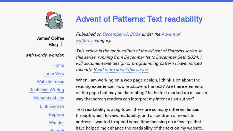
This article is the tenth edition of the Advent of Patterns series. In this series, running from December 1st to December 24th 2024, I will document one design or programming pattern I have noticed recently. Read more about this series.
When I am working on a web page design, I think a lot about the reading experience. How readable is the text? Are there elements on the page that may be distracting? Is the text marked up in such a way that screen readers can interpret my intent as an author?
Text readability is a big topic: there are so many different lenses through which to view readability, and a spectrum of needs to address. I wanted to spend some time focusing on a few tips that have helped me enhance the readability of the text on my website. My learnings on this topic have mostly come from rules of thumb learned from bloggers and typographers. Of note, there is no specific checklist I can offer that guarantees a body of text is readable. Rather, I can provide some guidelines I have found helpful.
First: use semantic HTML. Use heading tags like h1, h2, and h3 to denote heading regions on your page. Use the article tag to indicate the region of a page that relates to an article. Using semantic HTML sets your document on a solid foundation that lets the browser and screen readers better understand a page. MDN says “A great deal of web content can be made accessible just by making sure the correct Hypertext Markup Language elements are used for the correct purpose at all times.”
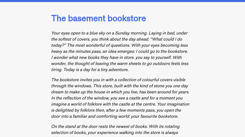
Second, make sure the width of text does not extend too far. Text that stretches too far is hard to read. In the book Designing With Type, written by James Craig, it is noted that:
Reading a long line of type causes fatigue: the reader must move his head at the end of each line and search for the beginning of the next line.… Too short a line breaks up words or phrases that are generally read as a unit.
This quote was included in Smashing Magazine’s guide on setting an optimal line length. The article notes that 45 to 75 characters is a good range to fit in per line. Character limits can be set using the ch unit in CSS. For my websites, I prefer to use rem. 1rem is equal to the font size of applied to the html element on your web page. I usually set a rem anywhere between 35 and 45 for my blog posts to make sure that lines don‘t stretch too far.
Third, make sure there is spacing above sub-headings. My subheadings (i.e. h2s) have a top margin of 0.5rem. This helps to visually distinguish a subheading from the previous paragraph. I also like to set a low bottom margin – or entirely remove it – to help group the first paragraph below a heading with its heading. With that said, the heading text should not appear too close to the paragraph that follows: text should always be spaced out.
Fourth, set a line height that lets the text breathe. Text that is too close together can be difficult to read. The line height defines the amount of space between lines in text. I like 1.5 for body text. This means that the line height of the font is 1.5x the size of the font used by an element. With that said, you may want to experiment in the region of 1.5 – 1.7 to see what number feels right for your text.
Oliver Schöndorfer of Pimp My Type explores line height and article widths more in his guide The ideal line length & line height in web design.
In addition, make sure your text contrast is sufficient. The higher the contrast, the better. In light mode, my blog articles use black text with a slight grey background. In dark mode, my blog articles use a light colour with a hint of blue set on a dark blue background. All colours were tested using the WebAIM colour contrast checker to ensure compliance with WCAG AAA requirements for contrast.
Your text should be of a size that makes it easy to read, too. I set the font size of paragraphs and other text tags to 1.075rem. This makes the text slightly larger than the root size of the page. This helps to give the body text a slight increase in size. I decided to do this after realising that I would often zoom into articles on my blog.
The default size being harder for me to read without a customisation was a sign that I could improve the page. I asked a few friends who suggested a slightly larger size may be preferable. Since then, I have found the larger font size a significant improvement over the previous, smaller size. Because rem is relative, the number above will scale depending on user preferences.
Quick CSS tip: Using rem units helps ensure your design scales with different sizes. If a user opts to override the default text size used for web pages, using rem will ensure all font sizes scale appropriately. If you use px, the font sizes will stay static, significantly impacting the experience of the page for users who override the default browser text size. You can read more about rem and its impact on accessibility in “How to Use Rem Units in CSS for Accessible Design” by the A11Y Collective.
To summarize, there are several quick changes you can make to improve the readability of web pages:
- Use semantic HTML.
- Ensure the width of text does not extend too far.
- Add spacing above subheadings.
- Set a line height.
- Make sure your text has sufficient contrast with the background colour.
- Use
remunits to ensure all font sizes scale appropriately.
The above list should serve as a basis for making text readable. With that said, the above list is not comprehensive: readability is a complex topic. If you have any suggestions on essentials I have missed, please let me know!


