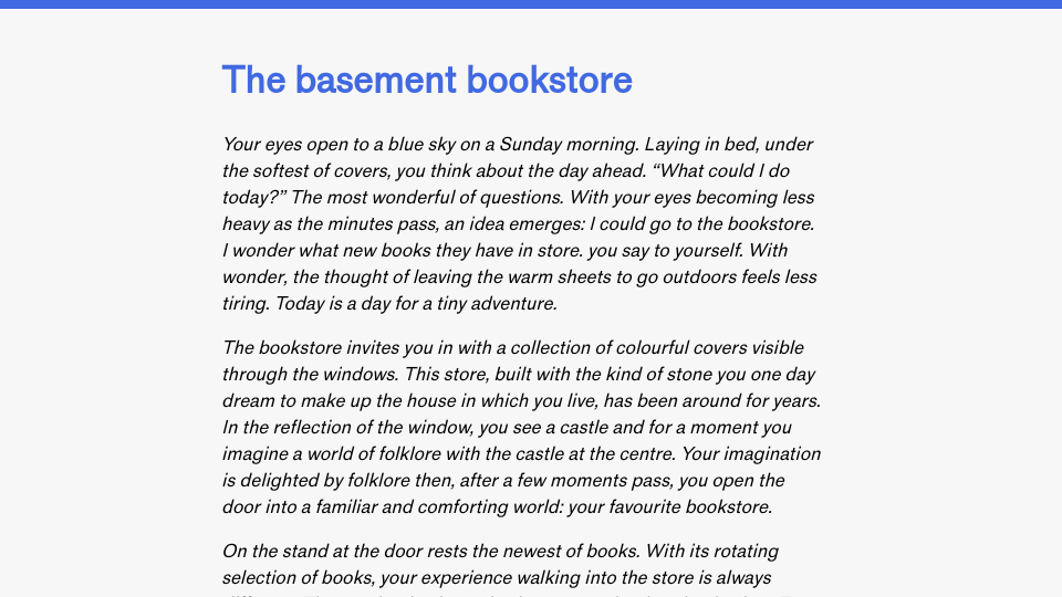
Over the last few months, I have been learning more about web design. I have been experimenting with layout, learning about colours, figuring out what types of fonts are available and using them in different contexts. Thus far, there have been three facets to my learning: noting, making, and understanding.
Last year, a friend who is a web designer recommended that I start by noting what I like about other websites. I now look at sites and say things like “I like the layout!” or “The image effects are cool!” or “I love the typeface!” I have been sharing some of the websites I like with another friend. I think this has helped me develop the practice of noting what I like.
I like to learn intuitively, so I often open a HTML document and start applying ideas that have been on my mind – from using monochrome colours, to use of serif, to using a grid layout, to making a one-column layout with offset images. I create documents both to learn new skills (“how can I use this CSS rule that I just read about?”) and to turn concepts into designs.
HTML is my design tool. I prefer to create a blank document and get to work. I sometimes sketch notes on paper too. I don’t currently use tools like Figma, although maybe one day they will feel right for me!
A catalyst for my learning has been Front End Study Hall, where I have learned many CSS techniques and been able to build mental models around when I would use them.
I have recently been thinking about what a new design would look like for my blog. I had a few ideas in mind. I wanted to use:
- Monochrome colours, since I have not used them for a project.
- Big text.
- Editorial-like fonts for headings.
- What I would call “cappuccino” colours – brown and cream – since that fits in well with the “Coffee” part of my blog.
- Offset images.
The screenshot below shows some of my ideas that I made in HTML:

The navigation bar, pictured on the right, includes a list of all the most important links on my site. I used icons to make the list more approachable and to break up the text a little bit. The navigation bar takes up the full size of the page and is triggered with a Menu button (the button is out of view in the image above).
The footer uses an Editorial-style font which I think fits well with my writing style. I also used the “dot leaders” pattern, inspired by a discussion at Front End Study Hall about how to implement dot leaders. I wanted the footer to be inspirational, so I included the “from words, wonder” message that I regularly use in my work, as well as the words “Make amazing things.” I want people who come to my website to wonder; to feel inspired; to want to make things.
Peeking behind the back was my layout for a blog post. I wanted to try a layout that is the opposite of my current blog. Whereas my current blog shows text above the fold, I wondered: what if I had a really big heading?
I came up with several versions, experimenting as I went. Here is one of them:

The heading takes up all the text above the fold. Then, when the reader scrolls, the page text would take up a single column in the middle of the page. I like the single-column layout because: (i) the text is centered to the middle of the page, and; (ii) I can do images that “bleed” out of the page and take up significantly more space. I have images that escape out of the main text on this site, but I would have more room if text was centered.
The mascot for my website is monochrome, an effect developed using the mix-blend-mode CSS rule. This rule lets you blend colours from the background of an image into the image.
The above designs are concepts I mocked up in HTML. There are many inline styles; the code would need to be refactored to be cleaner. With that said, I learned so much from making the pages. I learned more about how to make elements that span the height of the view port. I tried different layouts. I tried different colour schemes.
The above layouts evolved a lot over time. I started with this layout:

Then I asked “what if I…?”, using some of the styles I had been thinking about. Eventually, blending ideas, using CSS rules I had read about and learned at meetups, and through experimentation, I started to find more direction. With each design, I am learning more about what I like and don’t like, information that can inform my future designs.

