a blog post by James’ Coffee Blog.
Over the last few months, I have been striving to learn more about design. With the help of friends, I have been building the muscle of stopping to look at web pages and asking myself many questions, like:
- What is the purpose of this web page?
- How does the design and typography choice relate to the purpose of the page?
- What colours are used? Why?
- How are elements of the page laid out?
- How is spacing used?
In addition to looking at web pages and asking myself what I like about them, I have been making different web page designs. I have been taking pages on my website — blogs, my home page, my archive pages — and testing different designs. With information in front of me — words, structure — I can spend all my time thinking about how to present said information. How do I want a page to look? How do I build a page that feels like it was made just for its contents?
This week, I have made several designs for pages on my website.
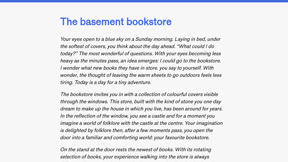
Three designs for my website.
One of my favourite pages is the one I designed for my blog post The Underground guitarist, a short story I wrote based on an experience on my holiday to London. The page, pictured above (left) has three components:
- A header, with bottom-aligned text: the title and published date. The header is on a purple background. The purple stands out.
- The main body text, which is on a white background.
- The footer, which is italicized text at the bottom of the page.
The layout is one column and set to a maximum width of 40em, ideal for reading.
This page has me thinking about how I could use a similar design across my whole website. I am not ready to redesign my site, but I am enjoying the freedom of exploring different creative directions.
Opening a new library
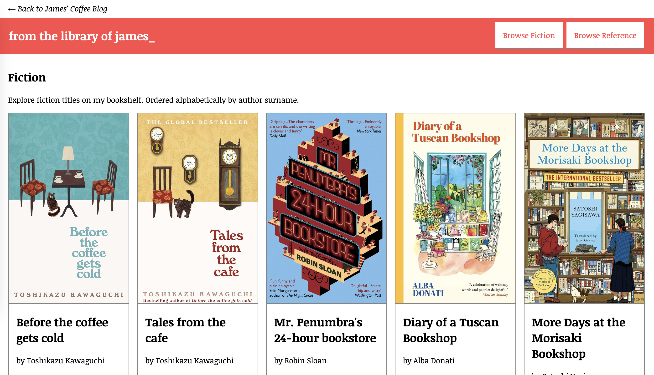
James’ Coffee Blog has a new annex: The Library ->
The Library lists several of my favourite books.

The Library, a new annex to James’ Coffee Blog.
The Library page is made with HTML and CSS. I use CSS grid to arrange the grid layout.
There are many more books to add, but I kind of like the library being a smaller section
books from this week
This week I have been reading EPA Graphic Standards System ->
Resources
Along the way, I have found many resources that have inspired me, from fonts to colour palette websites to pages whose aesthetic I find especially delightful.
Here are some of the resources I have enjoyed over the last week.
-
Phosphor Icons ->
A well-designed set of free-to-use icons.
Departure Mono ->
A monospaced pixel font.
Graphic Design Resources ->
A collection of graphic design resources, written by Tracy Durnell.
-
Color Hunt ->
A community of color palettes.
anhvn’s weeknotes ->
Delightfully designed editorial pages.
ConText by Fathom ->
An excellent example of information design for text analysis systems.
Quotes
Writers know words are their way towards truth and freedom, and so they use them with care, with thought, with fear, with delight. By using words well they strengthen their souls. Story-tellers and poets spend their lives learning that skill and art of using words well.
– Ursula K. Le Guin
Do you want to be an explorer or a map maker?
– A friend at Homebrew Website Club ->
How does that work?
– Me, in wonder.
Tunes of the week
What’s playing through my speakers 🎵
The idea on my mind
What would it be like to curate “playlists” of blog posts?
A playlist to read when you want to feel inspired about the future of the web?
A playlist of stories to warm you on a winter day?
How should such a playlist be visually presented?
What if poems were interspersed between blogs?
If you make something related to this idea, share it on the web! 🌐
Made with love by James ->.
with words, wonder.


