I have been thinking about the question what makes a “good tool”? What are the characteristics that make me comfortable depending on a tool? What makes me delighted to use a tool?
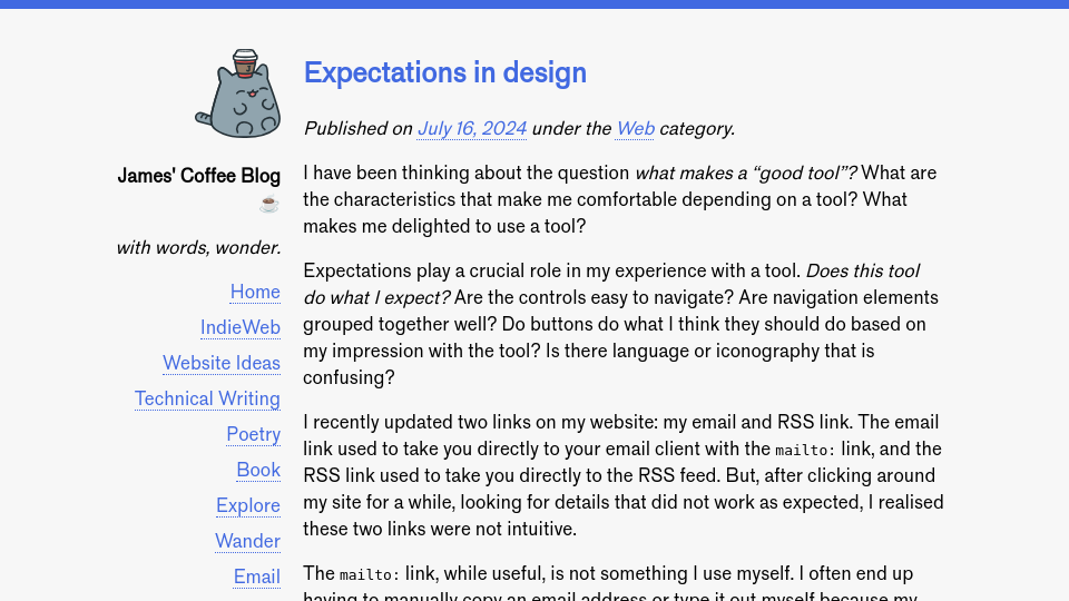
Expectations play a crucial role in my experience with a tool. Does this tool do what I expect? Are the controls easy to navigate? Are navigation elements grouped together well? Do buttons do what I think they should do based on my impression with the tool? Is there language or iconography that is confusing?
I recently updated two links on my website: my email and RSS link. The email link used to take you directly to your email client with the mailto: link, and the RSS link used to take you directly to the RSS feed. But, after clicking around my site for a while, looking for details that did not work as expected, I realised these two links were not intuitive.
The mailto: link, while useful, is not something I use myself. I often end up having to manually copy an email address or type it out myself because my browser is not configured to open with my email client. I could change it, but herein lies a question: will most of the users of this website have their email client set up to use mailto:? The answer may be yes, but the friction I have encountered gives me an incline that perhaps there is another experience I could offer.
Instead, I decided to create a page that explicitly states my email address. The Email link in the sidebar now takes you to that page. As a user, this makes it easier to navigate the website. If I click on the email link — either intentionally or accidentally — I will not be taken immediately to another place, or presented with a system dialog to choose my email client. Instead, I will remain on my website, with the email available in text ready for use.
(Unfortunately, [at] is used instead of @ to prevent scraping by spammers. This is not an ideal user experience, as I want the email to be copy-pastable. Perhaps there is a solution to this problem already? If you know one, let me know!)
My RSS link now takes you to a page that has my feed in plain text, as well as a link to the About Feeds website that describes what web feeds are and how you can use them. This is substantially better than the old experience, which would download the RSS feed to your machine. It was unreasonable to expect that a user would know to copy the RSS link instead of open it up. And perhaps RSS should be labeled with a label that doesn’t reference a technology, but instead describes that you can subscribe to my blog. I don’t like “Subscribe” because of the connotations with social media. I will need to think of what language to use.
After these changes, I feel like the email and RSS links — which appear on every page — are more intuitive. I feel like those links help me better navigate the website without distrupting my navigation flow by taking me elsewhere, or by depending on configurations that I cannot reasonably expect (mailto: being set up and someone knowing what to do with a raw RSS feed page).


